A few weeks ago I discovered this article in the Typewolf newsletter about the new website from design studio, Formafantasma:
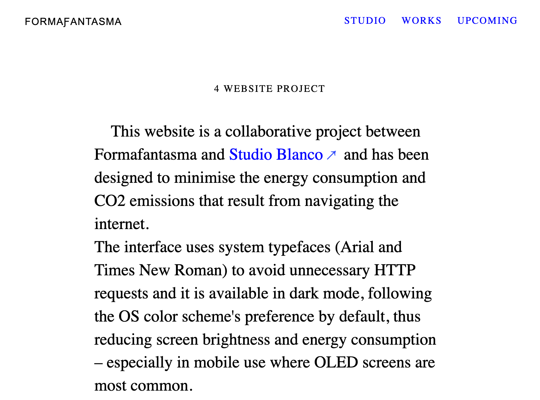
Instead of the latest quirky sans-serif, Formafantasma have gone with two of the most ubiquitous typefaces around: Arial and Times New Roman. Whenever I see Arial or Times New Roman in use, I’ll assume that no conscious thought at all has been put into that decision — someone has stuck with the default, the least controversial, the easiest option.
The interesting thing about the Formafantasma site is that they have made a conscious choice, but it isn’t an aesthetic one: using system fonts like Arial and Times New Roman instead of web fonts cuts down on HTTP requests, reducing the amount of data transferred and ultimately reducing CO₂ emissions.
System fonts vs Web fonts
A system font is one that is installed on a computer; these usually come included with Operating Systems, but can also be bundled with certain programs or installed manually. Web fonts are font files stored on a web server, that the browser downloads temporarily for the purpose of rendering a website the way the designer intended. In a single day, you might download hundreds of these files. Some of these might even be the same font but from different websites. The page you’re reading right now loads six web fonts and although some of these have been subset to be smaller than your average web font file, in total, they add over 90kB to the page weight.
Web fonts started gaining popularity with the introduction of services like Typekit in 2009. Before then, if web designers wanted text on their site to look the same across browsers and Operating Systems, they were restricted to a few “web-safe” system fonts.
Fast forward twelve years: web fonts are hugely popular, while system fonts have fallen out of favour, seen by many as boring and unimaginative. But web fonts aren’t free: yes, services like Google Fonts might not cost money, but your users are paying in other ways; improvements in font loading and new font file formats mitigate but don’t solve the fact that web fonts slow down website rendering, use more data, and increase energy usage. That’s why I’d like to suggest a more sustainable approach to choosing fonts I’ll call ‘system fonts first’.
Choosing better system fonts
Not all system fonts are bad; in fact, some are actually pretty good. Here I’ve listed my five favourite system fonts for body text, giving an example font stack with similar-looking fallbacks for Operating Systems that don’t support a specific font-family. I’ve tested compatibility on the five different devices I had to hand using this CodePen; different versions of each Operating System may differ from the platform information I’ve provided here.
Some operating systems may have non-standard behaviour. For example, newer android devices will swap Georgia or Palatino for Noto Serif; some Linux distributions include open-source copies of popular typefaces that behave in the same way. Remember: your website doesn’t need to look exactly the same on every browser and every device.
Georgia
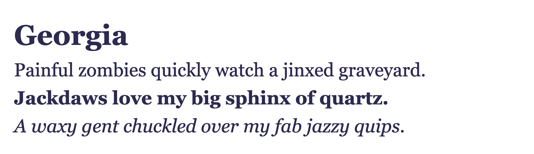
Platforms: Windows, Mac, iOS
font-family: Georgia, Times, Times New Roman, serif;Georgia is a serif typeface designed in 1993 specifically to look good on the low-resolution screens of the era. If you look closely, you’ll see that it eschews some of the finer detail seen in serif typefaces designed for print. Unlike other typefaces designed for the same purpose (e.g. Verdana), it still looks fresh on the HiDPI screens of today.
Charter
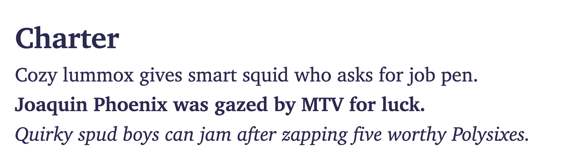
Platforms: Windows, Mac, iOS, Ubuntu
font-family: Charter, Bitstream Charter, serif;This is my personal favourite. Designed in 1987 by Matthew Carter, who would later design Georgia for Microsoft, Charter was donated by Bitstream to the XConsortium under a permissive licence that allows copies to be freely downloaded and modified. Charter was designed for low-resolution 300dpi printing, so it also works well on screen.
Palatino
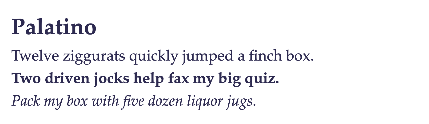
Platforms: Windows, Mac, iOS
font-family: Palatino, Palatino Linotype, Palatino LT STD, Book Antiqua, Georgia, serif;Named after the 16th-century calligrapher Giambattista Palatino, Palatino is influenced by type from the Italian Rennaisance. In an attempt to improve readability and legibility when printing on low-quality paper, it was given larger proportions than those designs on which it is based. This gives it the added benefit of also having good legibility on screen.
Hoefler Text
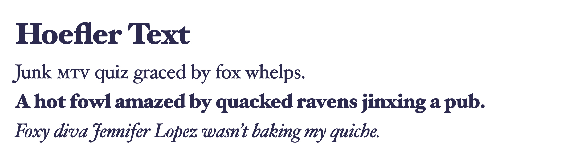
Platforms: Mac, iOS (but missing some advanced features)
font-family: Hoefler Text, Baskerville Old Face, Garamond, Times New Roman, serif;Hoefler Text is an old-style serif, designed in 1991 and included in every version of Apple’s OSX (now MacOS) since version 7.5. It is, along with other typefaces including Garamond and Sabon, inspired by the work of 16th-century engravers such as Claude Garamond. What sets Hoefler Text apart from most other system fonts is its rich feature set: it supports old-style figures, small-caps, ligatures and even decorative swashes. If you think you can’t do quality typography with system fonts, try using Hoefler Text.
The ‘system font stack’
Platforms: All
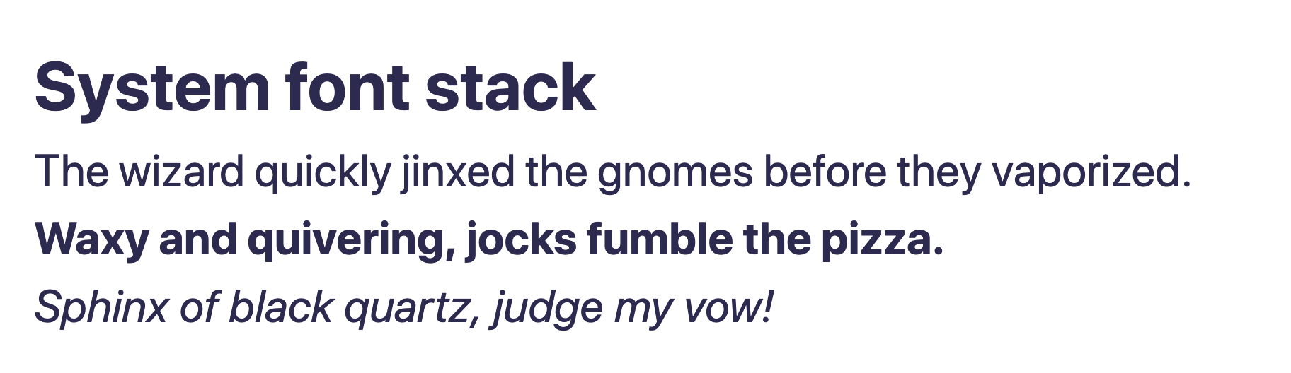
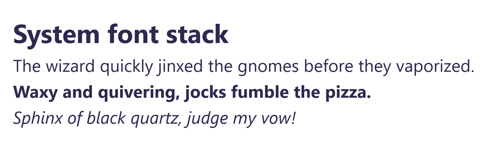
font-family: -apple-system, BlinkMacSystemFont, Segoe UI, Roboto, Helvetica, Arial, sans-serif, Apple Color Emoji, Segoe UI Emoji;
/* Only supported on Chromium-based browsers and Safari */
font-family: system-ui;
The goal behind the system font stack is to match the typeface on your website with the operating system UI. Here we make good use of the cascading nature of font-family declarations; the first font name recognised will be used, with others being ignored. For example, MacOS and iPhone will use -apple-system (an alias for San Francisco); Windows users will get Segoe UI, and Android users, Roboto.
Are web fonts really that bad?
I’d be remiss if I didn’t point out that, although they’re often one of the main culprits, in most cases, web fonts aren’t the biggest source of bloat on a website. As an example, the Formafantasma site may not load any web fonts but it does load JavaScript: 221kB worth (gzipped), including four tracking libraries with a combined size of over 160kB.
Byte-for-byte, JavaScript is more expensive for the browser to process than the equivalently sized web font[1]. When prioritising what to spend your performance budget on, remember that web fonts contribute to the beauty of your site. Tracking JavaScript does not.
When building my own site, I made a choice to prioritise typography over JavaScript. I’ve also become pretty attached to the fonts I’m using. But with new projects, I’ll be using system fonts first and only reaching for web fonts if I really think they add something. This gives me more room in my performance budget for other things including images, CSS, and maybe even some JavaScript.
Further reading
- Web fonts: when you need them, when you don’t by David Gilbertson
- A list of system fonts on iOS and MacOS
- System fonts on Butterick’s Practical Typography, 2nd Edition by Matthew Butterick
- Progressive Font Stacks (Twitter thread) by Tatiana Mac