Identifying (and fixing) accessibility issues is an essential part of any front end developer’s skillset, but it can sometimes be difficult to pick out the useful tools and techniques from the not so useful ones. There are also plenty of misconceptions out there, so I thought I’d make a post covering the tools and techniques that I use when testing web accessibility. To get the most from this exercise, I encourage you to follow along at home.
First things first, choose a website to test: if you’ve got a website of your own or work for a company with a website, you could use that, or if you’re looking for something inaccessible, you’re bound to find plenty of examples on Awwwards or Product Hunt.
0. First impressions
I’ve called this Step 0 because it’s entirely optional: it won’t detect anything you can’t test through other means. We won’t be looking at any source code or developer tools yet; this is all about the feeling you get when first visiting a site. It should take no more than a minute.
This step is based on the assumption that you can get a good idea of how much a site values accessibility by looking at the design choices made. Design is about solving problems and if the solution to that problem excludes a group of people, it’s often the result of an ableist culture at a company. If you find browsing a site unpleasant or frustrating, it’s almost certain that you’re not alone.
Here are some of the things I look for:
- Readability: How readable is the text? Can you read all the text at your usual distance from the screen or do you have to strain your eyes?
- Labels: Are there interactive elements like buttons or links represented only with icons?
- Video: Are there autoplaying videos? is there a way to stop them? are videos containing speech captioned?
- Animations: Are there an obnoxious number of animated elements? Do they make you feel nauseous?
These are early indicators that a site hasn’t been built with accessibility in mind. In the next steps we’ll get a bit more scientific and start identifying some common issues.
1. The Tab key
The next thing I’ll do is hit the Tab key. Not everyone navigates webpages using a mouse/trackpad/touchscreen — some rely on a keyboard. HTML supports keyboard navigation by default, provided it’s used properly, and this has been the case since the beginning of the web. Somewhere along the way, a sizeable proportion of developers seem to have either forgotten, or never learned this.
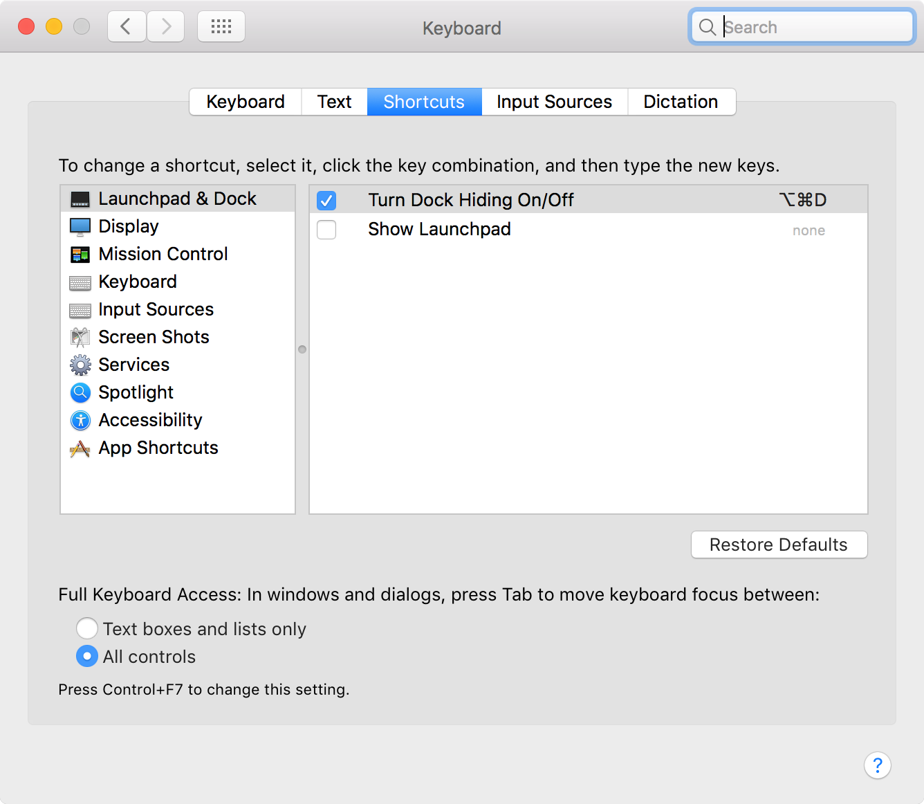
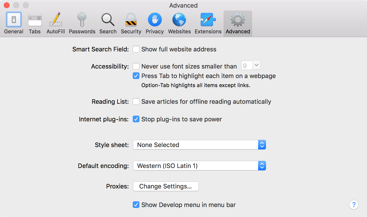
It’s important to note that not all browsers behave in the same way. In Google Chrome and Microsoft Edge on MacOS, and all the most common browsers on Windows, the tab key cycles through all types of interactive element: links, buttons, and form inputs. On MacOS there are two exceptions: In Firefox, while inputs and buttons receive focus, links do not. In System Preferences → Keyboard, click the Shortcuts pane; at the bottom, you’ll have either an “All controls” radio or a “Use keyboard navigation to move focus between controls” checkbox, depending on your MacOS version — check this (you may need to restart Firefox). Safari is the same as Firefox, in that it does not highlight links by default. You’ll need to go to the Safari menu in the top Menu Bar, select Preferences…, navigate to the Advanced pane, then under Accessibility, check the “Press Tab to highlight each item on a web page” checkbox.Firefox on MacOS
Safari on MacOS
When using the keyboard to navigate a site, you’re not restricted to just the Tab key. You can also use: Shift + Tab to go back in the tab order; Enter to open a link; Space to scroll the screen down (or interact with a button if focused); and the arrow keys (↑ / ↓ / → / ←) to go between radio and checkbox inputs.
If you find yourself reaching for your mouse or trackpad, drag this bookmarklet onto your bookmarks bar. Pressing it will hide your cursor completely.
Manuel Matuzovic offers a great breakdown of all the things that you can test with the Tab key. Here are the three I think are most important to check:
- As you tab through the page, can you see which item has focus? It’s common for developers (possibly under pressure from designers or managers) to remove default focus styling for ‘aesthetic reasons’
- Is everything interactive focusable? Developers often use the wrong element (e.g. a
<div>with anonclickevent attribute) when there’s a better element available (like a<button>) - In cases where JavaScript is used to modify the DOM (e.g. if a site uses client-side routing, lazy-loads more list items as you scroll, or uses modal windows), is focus handled correctly?
Considering that issues one and two can be prevented by following two simple rules: a) don’t remove :focus styling and b) use the correct semantic HTML element, it’s amazing how often these issues occur. In the article, I Used The Web For A Day With Just A Keyboard, Chris Ashton uses the following example of a span which should be a link:
<span onclick="window.location = 'https://google.com'">Click here</span>The above element might be styled to look exactly like a link, but a keyboard user would be unable to use it because a span isn’t a focusable element.
“Keyboard-users are standards-reliant users, whereas the able, sighted demographic is privileged enough to be able to interact with the element despite its non-conformance.”
2. Automated testing tools
The main benefit of automated tools is their convenience: they give you a quick, reproducible result. They’re great for finding ‘low-hanging fruit’ — those accessibility issues that are easiest to fix. If you only follow one step in this post, this is probably the one that gives the most results for the least effort.
If I already have an idea that something specific is wrong, the first thing I like to do is to click the tota11y bookmarklet. This brings up an overlay which has different options to highlight individual elements causing accessibility issues:
- Labels each element with its colour contrast ratio, marking any which do not pass the AA standard in red.
- Shows images with missing
alttext - Shows inputs without labels
- Highlights links with missing or unclear link text
This is the point where I usually run Lighthouse. If you’re using Google Chrome, you can find it in the browser dev tools. If you prefer a different browser, you can run it from a bookmarklet or use a hosted service like Lighthouse Metrics. Lighthouse measures more than just accessibility: it has sections for performance, best practices and SEO. Don’t ignore these other scores — poor performance also impacts accessibility and a slow site can be frustrating for anyone.
Lighthouse catches many common accessibility violations, but you’ll find that different tools detect different issues. The Web Accessibility Initiative (WAI) lists 155 different Web Accessibility Evaluation Tools. Here are a few worth trying:
- axe is an accessibility checker with extensions for both Chrome and Firefox. It’s based on the open source JavaScript library axe-core and aims to return zero false positives.
- WAVE Web Accessibility Evaluation Tool is another automated accessibility checker; it also has Chrome and Firefox extensions
- The W3C Validator isn’t specifically an accessibility testing tool, but as we covered in step 1, well-written, semantic HTML can really help to make a site accessible.
Automated tools can’t detect every issue: figures range from 25–35% of issues[1] to 71% when combining results from different tools[2]. To find the remaining issues we need to think more about how disabled people actually use the web. In the next step, we’ll cover assistive technologies and start using one.
3. Screen reader testing
Assistive technology is any device or system which helps support and assist people with disabilities to perform specific tasks that might otherwise be difficult or impossible. Today we’ll focus on screen readers, programs which read on-screen content out loud. Examples include VoiceOver on Macs and iOS devices; JAWS and NVDA on Windows; and TalkBack on Android devices. Not all users with visual impairments use screen readers — some may use a screen magnifier like 'Zoom' on MacOS or Magnifier on Windows. There are also Refreshable braille displays which work by electronically raising and lowering different combinations of pins to form braille characters dynamically (as these range in cost from $3,500 to $15,000 I will forgive you if you don’t go out and buy one immediately).
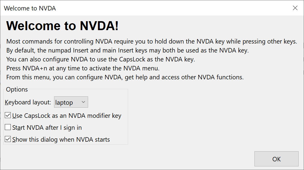
Each screen reader behaves slightly differently, so it makes sense to test using as many different programs as possible, on both desktop and mobile devices. For the sake of convenience, it’s worth getting familiar with a screen reader on your development machine. I’ve included a couple of brief guides to get you started — one for Windows users and another for those on a Mac: Windows comes with a screen reader, Narrator, but most screen reader users on Windows opt to install a third-party program, the most popular being NVDA and JAWS. JAWS will set you back $90/year but NVDA is free and open source, so that's what I'd suggest you start with. Once you’ve downloaded and installed NVDA, you can open it at any time using Ctrl + Alt + N. When you first open NVDA, you’re shown a dialog with Options, including a setting for Keyboard layout: most guides online seem to favour desktop, so choose that even if you don’t have a number pad unless you’re planning to use more advanced features. Now if you go back to your browser (I recommend either Firefox or Chrome), you should be able to navigate the webpage using the same keys as in Step 1, but now NVDA will announce the content of each focused element (this is called 'focus mode'). If you want to hear non-focusable elements you can use the up and down arrow keys (this is called 'browse mode'). NVDA also announces the content of elements as you hover the mouse cursor over them. Most NVDA-specific keyboard commands consist of the NVDA modifier key pressed in combination with other keys. By default, the NVDA modifier key is Insert, but you can also configure it to use Caps Lock (which makes entering certain key combinations one-handed, much easier). The NVDA modifier key will be referred to as NVDA for the rest of this article. NVDA has lots of commands, I’ll only be covering those I’ve found most useful: If you use a Mac, you’ll already have VoiceOver installed. To start (or stop) VoiceOver, press Cmd + F5 or if you have a Mac with a Touch Bar, hold Cmd + tap the Touch ID / Power button three times. When using VoiceOver, the best browser to test in is Safari. To navigate with VoiceOver, the 'VoiceOver modifier' keys (referred to as VO for the rest of this article) are used in combination with other keys. The default VO keys are either: Remember these because every other shortcut uses them. You can press Ctrl at any time to pause VoiceOver. To resume speaking, press it again. VoiceOver draws a dark rectangle around the area where it’s focused. This rectangle is called the “VoiceOver cursor.” You can continue to use the same keys as in Step 1 to move between the standard focusable elements (e.g. links, buttons and inputs) and the VoiceOver cursor will follow. To move the cursor through all elements (not just those focusable), use VO + → / ←. VoiceOver will announce the text of each element and if it’s interactive, how to interact with it. Sometimes when navigating a page, you’ll come across an interactive element with elements inside it. e.g. toolbars, lists, tables etc. Press VO + Shift + ↓ to start interacting with the current element — think of this as moving your cursor down into the element. You can then cycle through its children using VO + → / ←; the VoiceOver cursor will stay within the parent element. Press VO + Shift + ↑ to bring the cursor back up out of the element. You can bring up the VoiceOver help menu at any time you’re using VoiceOver with the shortcut: VO + HNVDA on Windows
Resources
VoiceOver on MacOS
Resources
Here are some things to check for when testing with a screen reader:
- Do all images have meaningful alt text?
- Do links make sense out of the context of the content around them? Text like "Read more" or "Click here" doesn’t tell you anything about what you’re clicking on.
- Does the visible content match what you hear? Well-meaning developers may add overly-long
aria-labels to an element, or hide visible elements from screen readers usingaria-hidden— Not all screen reader users are blind and any mismatch between what’s visible and what’s spoken can be confusing.
If you want to really understand how screen reader users navigate the web, I highly recommend watching the video How A Screen Reader User Surfs The Web with Léonie Watson.
4. Next steps
At this point, you should have uncovered the majority of issues on your site, but when it comes to accessibility, you can always do more. I cannot stress this enough: don’t wait for users of your site to report problems — most users who find your site inaccessible won’t get in touch to complain, they’ll leave and won’t come back. Accessibility isn’t something you can mark as done — it’s an ongoing task. A proactive approach to accessibility is always better than a reactive approach:
- Get familiar with Web Content Accessibility Guidelines (WCAG) — these are a set of recommendations for making web content more accessible and are widely used as the basis for accessibility laws and policies[3].
- Pay an accessibility professional to test your website.
- Use a tool like Speedlify to periodically test your site so you can catch regressions early. Speedlify runs both Lighthouse and axe and can be integrated into your Continuous Integration (CI) workflow.
Conclusion
How have you done? If you’ve found zero accessibility issues, Congratulations! sites with no accessibility issues are incredibly rare — in a survey of one million website homepages, WebAIM found that 98.1% of had detectable WCAG 2.0 failures and that study used an automated tool (WAVE, mentioned earlier), so I’d expect the real chance of finding a site with no WCAG failures is close to zero.
If you’ve found major accessibility issues, it’s usually due to either: a lack of knowledge; ‘aesthetics’ trumping accessibility[4]; or developers being overruled by another department (e.g. marketing). If you still need convincing, or need to convince someone else, why accessibility is important, I’d recommend a11y.coffee for a good introduction. If it’s not your site, call them out publicly — ignoring web accessibility is a legal issue and in 2019, 2,256 web accessibility lawsuits were filed in the US[5].
I hope that you’ve found this exercise a useful introduction to web accessibility testing. I encourage you to try different tools and technologies and assemble an accessibility testing toolkit which works best for you. I expect that automated testing tools like Lighthouse will be an essential part of that toolkit, but they’ll only get you so far — eventually, you’ll need to roll up your sleeves and get your hands dirty with some manual testing.
The WebAIM Million: An annual accessibility analysis of the top 1,000,000 home pages ↩︎
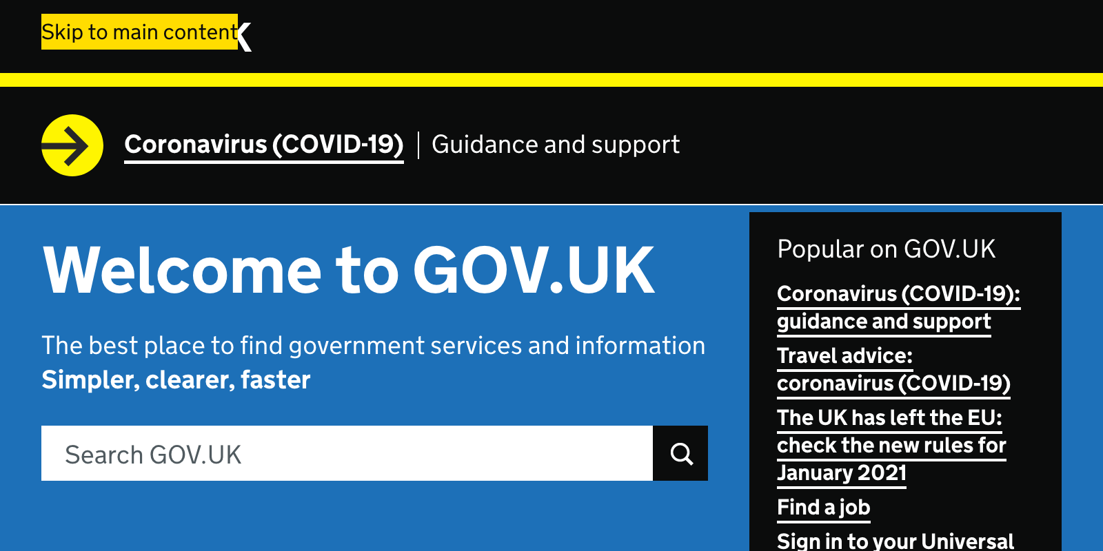
What we found when we tested tools on the world’s least-accessible webpage, GOV.UK, Accessibility in government blog ↩︎
The Web Accessibility Initiative (WAI) lists forty Web Accessibility Laws and Policies, 25 of which are based on WCAG ↩︎
The so-called aesthetics vs accessibility debate isn’t one I want to go into here. Let me just say it’s in no way a dichotomy — you can make an aesthetically pleasing site that’s also very accessible and anyone who says you can’t is severely lacking in imagination and/or talent. ↩︎
The Curve Has Flattened for Federal Website Accessibility Lawsuits, Seyfarth Shaw ↩︎