This is part two in a series. You can read part one here.
If you’ve already implemented the basics of serving performant web fonts, you’ll hopefully have faster loading fonts. But you won’t have completely solved the issues of FOIT/FOUT. Why? because there's no one magic solution — there are plenty of methods, each of which have their own downsides.
To recap:
- The Flash of Invisible Text (FOIT) is the period of time when text is invisible, before the browser has downloaded a web font.
- The Flash of Unstyled Text (FOUT) is the period of time where text is rendered using a fallback font, before the browser has downloaded a web font.
Typography on the web is often hampered by two things:
- The ability of the web as a platform to support the vision of the designer (although things are rapidly improving in this area)
- The need for performant sites
Take a glance at some of the sites on Awwwards and you’ll notice that performance often takes a back seat. By making users look at a spinner or progress bar while assets download (these can include fonts, but also usually multiple megabytes of JavaScript), you can mask any flash of unstyled/invisible text.
The amount of work you put into solving these problems should be proportional to how important that initial page load is to you. If most of your page views are from new visitors, or the first impression you give to users is super important, you should prioritise this more. On this site, I’ve implemented each of the five recommendations from my previous article but haven’t gone any further.
I’ve previously written about some of the reasons for choosing system fonts over web fonts, but there’s one more which I didn’t mention and it might just be the best: you no longer have to think about this stuff. If you do think finding the best possible font loading strategy is worth your time, carry on reading. We’re about to enter the zone of diminishing returns.
How fallback fonts affect Cumulative Layout Shift (CLS)
No matter how well you optimise your web fonts, there’s going to be a wait before they’re downloaded. There will also be times when they don’t load at all. Unless you’re hiding text until after your web fonts have loaded (using CSS font-display or JavaScript) or using a browser which favours FOIT over FOUT, the browser will fall back to the next font-family in the stack that it has access to. As an example, take the CSS font-family declaration I use for body text on this site:
font-family: Spectral, Georgia, serif;My preferred typeface for this site is Spectral, but I’ve also declared two fallbacks: the first is Georgia, a serif typeface installed on most Operating Systems, and the second is the Operating System’s default serif which will differ based on the OS. This is a good way to keep some control over typography even when users don’t get to see my chosen web font.
The other benefit of choosing the right fallback fonts is reducing layout shift. Here are some examples:
- An image without a pre-defined width and height loads in, and pushes all the content below it downwards
- You’re about to click a link and another element is inserted above it, pushing the link from under your cursor
- You start reading an article but part way through, the text re-renders at a different size causing you to lose your place
Cumulative Layout Shift (CLS) is a combined measure of every one of these layout shifts. It’s also one of the Core Web Vitals Google takes into account when determining search rankings. The reason why switching fonts can cause layout shifts is because different fonts have different font metrics:
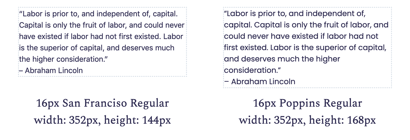
Font metrics

Every font file contains a set of metrics, which determine how much space each character should take up and the spacing between characters. When the browser switches out a fallback system font for a web font, small differences in these metrics between the two fonts at the character level can make a big difference over a whole line of text.
For example, switching a font with narrower characters for one with wider ones reduces the number of characters that can fit on a single line, causing lines to break earlier. This increases the total number of lines and therefore also increases the height of our text blocks.
The following screenshot shows the same text in two different fonts, both using the same font-size and line-height. Due to the extra width of certain characters in Poppins, the quote takes up an extra line even with a short measure of around 50 characters per line[1]. From this, we can determine that San Francisco would be a bad choice of fallback font for Poppins.
Choosing a fallback font with similar metrics is one of the keys to minimising layout shift. A great tool for finding these fonts is Monica Dinculescu’s Font style matcher. Use it to compare your desired font with a few common system fonts and choose the one with the least noticeable shift.
On this site, I was lucky that Spectral and my chosen fallback are close enough without the need to make any other adjustments. In other cases (especially when using condensed or wide fonts), you’ll need to adjust the font-size, line-height, or letter-spacing to match. Previously, you needed to do this using the CSS Font Loading API (confusingly, a JavaScript API) to detect when our web font has loaded.
JavaScript font loading strategies
CSS Font Loading API
The Flash of Faux Text (FOFT)
The Flash of Faux Text (FOFT) is
https://www.zachleat.com/web/comprehensive-webfonts/ https://css-tricks.com/the-best-font-loading-strategies-and-how-to-execute-them/
Serve your fonts as inline data URIs
If you really hate FOUT, but want to minimise the time where users can’t see the text, you can serve your font as part of your CSS by converting it to a data URI
font-size-adjust
9. Consider variable fonts
Font-synthesis
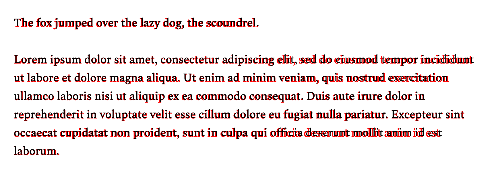
Sometimes the browser is tasked with rendering text in a specific font-style, font-variant, or font-weight, but doesn’t have the correct font loaded. Take the example of fake (or faux) italics: if you’re only loading the roman/normal style font, whenever the browser encounters an <em> tag, it will attempt to italicise the font itself via a process called font-synthesis. Browsers are not good at this.

There are some typefaces where you may be able to get away with not loading an italic font; for example when using blocky fonts like Eurostile next, but if you’re using a serif typeface, fake italic is highly noticeable. For an in depth exploration of the subtleties of italics, I recommend this article by Toshi Omagari.
Similarly to fake italics, if you only load the normal, 400-weight font, but use <strong> tags or font-weight: bold;, the browser will try to fatten-up each character — this generally looks very bad. The same is true for small-caps: a

If we’re being dramatic here, we can use the term, ‘type crimes’. There are plenty of other type crimes which can be much harder for a developer to police, especially when dealing with Content Management Systems (CMSs) and WYSISWYG[2] editors. If your site shows user-generated content, restrict the available formatting options to only those that your website frontend supports.
If you’re unsure whether you’re seeing font-synthesis or not (sometimes it can be pretty subtle), you can use the faux pas script to highlight text in faux bold or faux italic. It also comes as a handy bookmarklet.
Further reading
Zach Leatherman has written at length about web fonts and all of his articles are worth reading. Here are some highlights:
- https://www.zachleat.com/web/font-checklist/